Master Operations Management: Boost Productivity, Optimize Workflows, Forecast with Precision!
5.0(0)
7 learners
What you'll learn
Understand and calculate basic productivity metrics.
Create and analyze workflow network diagrams for process optimization.
Perform critical path analysis to manage project timelines effectively.
Apply total quality management techniques using Excel for quality improvement.
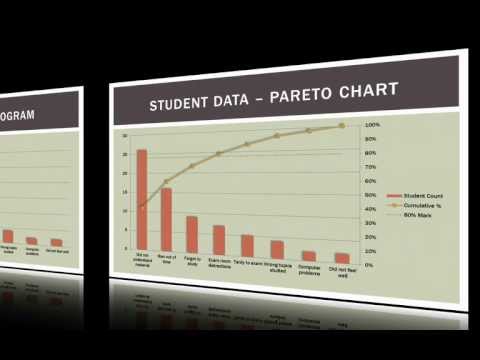
In this video, we continue our discussion about quality management in business, education, and other applications by talking about Pareto charts and their implementation in Excel. You can find the corresponding blog post here: http://wp.me/p1TVs6-tn
What are Pareto Charts? What data do we need to construct a Pareto chart? How must we organize that data? How can we generate a Pareto chart in Excel even though Excel does not have a built-in Pareto chart maker? How can we interpret our Pareto chart to help us make decisions?
My playlist table of contents, Video Companion Guide PDF documents, and file downloads can be found on my website: https://www.bcfoltz.com
Continue this lesson in the app
Install CourseHive on Android or iOS to keep learning while you move.