
Summary
Full Transcript
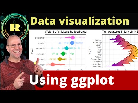
This video is part of a series of videos that consider data analysis using R programming. It is primarily for beginners. In this video I talk about using R to visualise your data. Data visualization using R is best done using the ggplot (ggplot2) package. You'll learn the principles of creating plots and graphs to present your data including when to use a barplot, a histogram, a density plot, a scatter plot, a boxplot and more. The video focusses on understanding what plot to create depending on the data that you have (either categorical or continuous or a combination of the two). If you are interested in data analysis, statistical analysis then this series is for you. It starts with explore your data, then goes on to clean, manipulate and now visualize your data. A huge thanks to Nested Knowledge for supporting the creation of this video. I you are doing research of any kind, you'll need to do a literature review. Nested Knowledge allows you to create and share your systematic literature reviews online. Go to: https://nested-knowledge.com

Continue this lesson in the app
Install CourseHive on Android or iOS to keep learning while you move.





