Summary
Keywords
Full Transcript
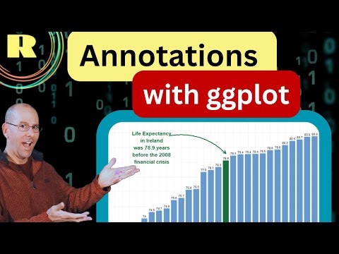
Plots and graphs created with ggplot can be brought to life with informative annotations. This video deals with using the ggplot2 package to create a bar plot in which a specific bar has its own color and an annotation is provided as an explanatory note inside the plot. Data visualization is all about telling a story and learning to annotate your plot and graphs is an important skill for any data scientist or statistician. So if you're into R programming then you'll love this video that forms part of the tidyverse series of teaching. I'd you are interested in doing a Masters degree in applied statistics and data science, then check out the UCLA programme here: https://master.stat.ucla.edu/ Find me on LinkedIn: https://www.linkedin.com/in/drgregmartin/

Continue this lesson in the app
Install CourseHive on Android or iOS to keep learning while you move.