
Summary
Keywords
Full Transcript
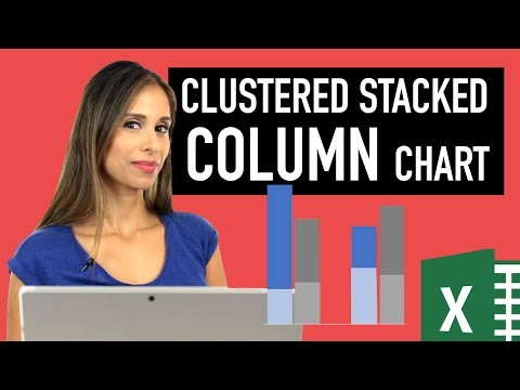
🔥 Create charts that wow your audience. Learn the secrets now—start today! 👉 https://link.xelplus.com/yt-g-stacked-charts-course Create professional Clustered and Stacked combination graphs in Excel with this dynamic workaround. Excel doesn't offer a native clustered-stacked chart type, making it difficult to present multi-layered divisional data clearly. In this tutorial, we move beyond basic charting to build a dashboard-ready visual using the Secondary Axis technique and a clever Invisible Series trick to keep your data perfectly aligned. ⬇️ Download the workbook here: https://www.xelplus.com/excel-clustered-column-and-stacked-chart/#download Easy steps to create a clustered stacked column chart in Excel - this chart is both stacked and clustered. This type of chart is not available in the standard Excel chart selection. With a few steps, you'll learn how to create this from scratch. 00:00 Intro: The problem with Excel combination charts 00:41 How to structure your data for Clustered-Stacked graphs 01:43 Inserting the initial chart and switching Rows/Columns 02:31 Step 1: Moving data to the Secondary Axis 03:46 Step 2: Adding the "Invisible Value" series for axis alignment 05:20 How to force Primary and Secondary Y-axes to match 06:58 Formatting: Cleaning up the Legend and Axis 08:03 Pro Design: Adjusting Gap Width and Overlap 09:02 How to position Data Labels for maximum readability 09:46 Final Polish: Adding dynamic text boxes to your chart 10:32 Summary of the combination chart technique What you will master in this guide: - The Data Setup: How to structure your table for multi-series combination charts. - Secondary Axis Mastery: The secret to layering stacked columns on top of clustered ones. - The "Invisible" Fix: Using a hidden data point to ensure your Y-axes match automatically every time. - Dashboard Formatting: Reducing gap width and using "Inside Base" labels for a polished look. - Dynamic Labels: Adding a custom text box that moves with your chart 🎓 500,000+ professionals trust our courses—start your journey here 👉 https://link.xelplus.com/yt-d-all-courses 📈 Perfect for: - Excel users of all levels, especially those in data analysis and reporting. - Anyone looking to enhance their Excel charting skills. - Those who need to present data in an engaging, easily understandable format. 🔑 Key Takeaways: - Simplify complex Excel charting tasks. - Ensure your data stands out with advanced formatting techniques. - Learn to automate and dynamically update your charts. Links to related videos: Charts Basics: https://youtu.be/DAU0qqh_I-A Dynamic Charts based on drop-down selection: https://youtu.be/22jcw5slQJk ➡️ Join this channel to get access to perks: https://www.youtube.com/channel/UCJtUOos_MwJa_Ewii-R3cJA/join 👕☕ Get the Official XelPlus MERCH: https://xelplus.creator-spring.com/ 🎓 Not sure which of my Excel courses fits best for you? Take the quiz: https://www.xelplus.com/course-quiz/ 🎥 RESOURCES I recommend: https://www.xelplus.com/resources/ 🚩Let’s connect on social: Instagram: https://www.instagram.com/lgharani LinkedIn: https://www.linkedin.com/company/xelplus Note: This description contains affiliate links, which means at no additional cost to you, we will receive a small commission if you make a purchase using the links. This helps support the channel and allows us to continue to make videos like this. Thank you for your support! #Excel

Continue this lesson in the app
Install CourseHive on Android or iOS to keep learning while you move.





